How do you present the results of your study? One of the convenient ways to do it is by using graphs. How are graphs interpreted? Here are very simple, basic tips to help you get started in writing the results and discussion section of your thesis or research paper. This article specifically focuses on graphs as visual representation of relationships between two variables.
My undergraduate students would occasionally approach me and consult on some of their difficulties they encountered while preparing their thesis. One of those things that they usually ask me is how they should go about the graphs in the results and discussion section of their paper.
How should the graphs and the table be interpreted by the thesis writer? Here are some tips on how to do it, in very simple terms.
Interpreting Graphs
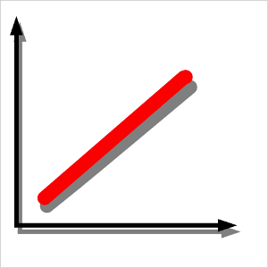
Graphs are powerful illustrations of relationships between the variables of your study. It can show if the variables are directly related. This is illustrated by Figure 1. If one variable increases its value, the other variable increases, too.

For example, if you pump air into a tire, the tire expands, and so does the air pressure inside it to hold the rubber up. This is the pressure-volume relationship. If pressure is increased, there is a corresponding increase in volume. The variables in this relationship are pressure and volume. Pressure may be measured in pounds per square inch (psi) and volume in liters (li) or cubic centimeters (cc).
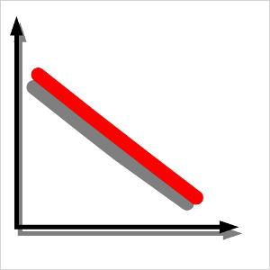
How about if you have another graph like the one below (Figure 2)? Well, it’s simple like the first one. If one variable increases in value, the other variable decreases in proportionate amounts. This graph shows an inverse relationship between the two variables.

For example, as a driver increases the speed of the vehicle he drives, the time it takes to reach the destination decreases. Of course, this assumes that there are no obstacles along the way. The variables involved in this relationship are speed and time. Speed may be measured in kilometers per hour (km/hr) and time in hours.
The two examples given are very simplified representations of the relationship between two variables. In many studies, these relationships seldom occur. Graphs show something else. Not really straight lines but curves.
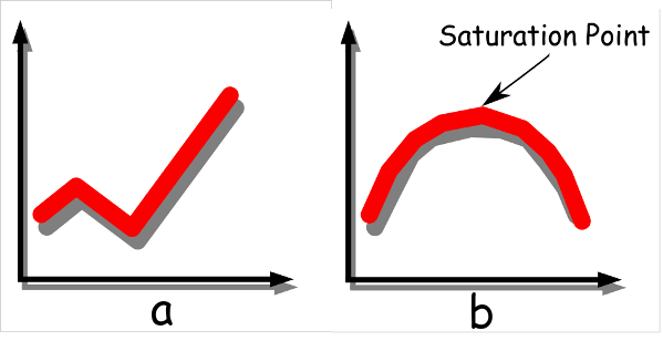
For example, how will you interpret the two graphs below? Some students have trouble interpreting these.

Graph a actually just shows that the relationship between the two variables goes up and down then progressively increases. In general, the relationship is directly proportional.
For example, Graph a may show the relationship between profit of a company through time. The vertical line represents profit while the horizontal line represents time. The graph just portrays that initially, the profit increased then at a certain point in time decreased, then recovered and increased all the way through time.
Something may have happened that caused the initial increase to decline. The profit of the company may have declined because of recession. But then when recession was up, profits continued to increase and things get better through time.
How about Graph b? Graph b just means that a variable in question reaches a saturation point. This graph may represent the number of tourists visiting a popular island resort through time. Within the span that the study was made, say 10 years, at about five years since the beach resort started operating, the number of tourists reached a climax then started to decline. The reason may be a polluted coastal environment that caused tourists to shy away from the place.
There are many variations in the relationship between two variables. It may look like an S curve going up or down, plain horizontal line, or U-shaped, among others. Those are actually just variations of direct and inverse relationship between the two variables. Just note that aberrations along the way are caused by something else, another variable or set of variables or factors that affect one or both variables, which you need to identify and explain. That’s where your training, imagination, experience, and critical thinking come in.
©2014 November 20 Patrick Regoniel


Very useful information. Great presentation!